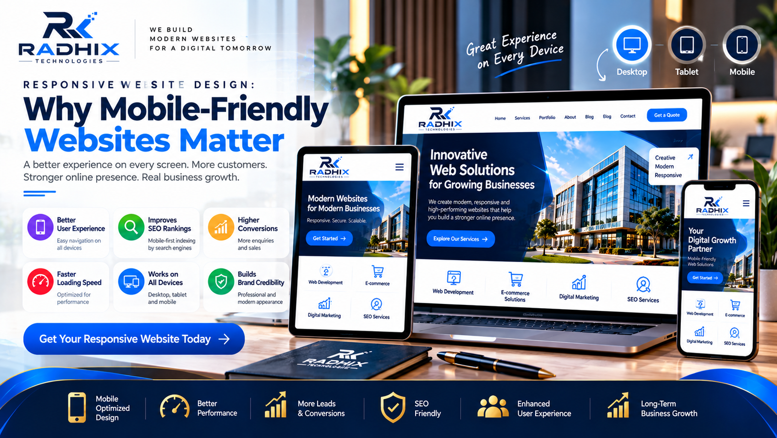
Responsive Website Design: Why Mobile-Friendly Websites Matter
In today's digital world, customers use smartphones, tablets, laptops, and desktop computers to browse websites, compare products, and find services. Businesses that provide a smooth browsing experience across these devices can make it easier for visitors to explore their offerings and connect with their teams.
This is why responsive website design has become an essential part of modern website development. A mobile-friendly website adapts to different screen sizes, keeps content readable, and allows users to navigate pages without unnecessary effort.
Whether you run a startup, an e-commerce store, a corporate organization, or a local service business, investing in responsive website design can help strengthen your online presence. Radhix Technologies helps businesses explore modern web development solutions designed around usability, performance, and business objectives.
What Is Responsive Website Design?
Responsive website design is an approach to web development in which a website's layout and content adapt to the screen size and capabilities of the device being used.
Instead of creating completely separate websites for desktop and mobile users, responsive design generally uses flexible layouts, scalable images, and CSS media queries to adjust the presentation automatically.
For example, a desktop website might display several product categories side by side, while the same content appears in a single-column layout on a smartphone. Navigation menus, images, buttons, and text also adjust to provide a more comfortable browsing experience.
A properly implemented responsive website helps users access the same essential information and functionality across different devices.
Why Do Mobile-Friendly Websites Matter?
1. Better User Experience
User experience plays an important role in how visitors interact with your website. If users need to zoom in repeatedly, scroll horizontally, or struggle to click small buttons, they may leave without exploring your services.
A mobile-friendly website makes navigation simpler by providing readable text, suitable spacing, clear menus, and accessible buttons.
When visitors can find information easily, they can make informed decisions and contact your business with less friction.
2. Supports Search Engine Optimization
Mobile usability is an important consideration for search engine optimization. Google primarily uses the mobile version of a website's content for indexing, making it important to ensure that mobile visitors can access the same essential content as desktop users.
Responsive website design can simplify website management by maintaining one set of URLs and content across devices.
However, responsive design alone does not guarantee higher search rankings. Content quality, page experience, technical SEO, relevance, and competition also influence search performance.
3. Reaches More Mobile Users
Many people use smartphones to search for businesses, compare services, read reviews, and make purchasing decisions.
A responsive website allows your business to serve these visitors without requiring them to switch to a desktop computer.
For local businesses in Faridabad, Delhi NCR, and other markets, a mobile-friendly website can make it easier for potential customers to view services, access contact details, request quotations, and find location information.
4. Improves Website Engagement
When visitors can browse your website comfortably, they may find it easier to explore multiple pages and interact with relevant features.
Clear navigation, readable content, well-placed calls to action, and accessible forms can support engagement.
Businesses can use analytics tools to understand how visitors interact with mobile pages and identify areas that need improvement.
5. Helps Generate Leads and Conversions
Your website should make it easy for visitors to take the next step, whether that means submitting an enquiry, booking an appointment, requesting a quotation, or purchasing a product.
Responsive design helps ensure that important conversion elements work effectively on smaller screens.
Examples include mobile-friendly enquiry forms, click-to-call buttons, WhatsApp links, simplified checkout pages, and easy-to-use booking forms.
A better mobile experience can reduce unnecessary barriers, although actual conversion results depend on the offer, audience, content, and overall website quality.
6. Creates a Professional Brand Image
Your website is often one of the first places where potential customers encounter your brand.
A website that displays correctly across devices communicates attention to detail and helps present your business professionally.
Consistent branding, readable content, high-quality images, and predictable navigation can strengthen the overall impression of your business.
An outdated or difficult-to-use mobile website, by contrast, can make it harder for visitors to understand your services.
7. Improves Website Performance Opportunities
Responsive design and performance optimization work together to create a better user experience.
A responsive website should not simply shrink desktop content to fit a smaller screen. Developers should also consider image sizes, scripts, fonts, layout complexity, and other factors that affect loading speed.
Techniques such as image compression, lazy loading, caching, and efficient code can help improve performance when implemented appropriately.
Fast-loading pages can make browsing more convenient, especially for visitors using slower mobile connections.
8. Makes Website Management Easier
Maintaining separate desktop and mobile websites can introduce additional work when updating content, managing links, and maintaining functionality.
A responsive website generally allows businesses to manage one main website while adapting its presentation to different devices.
This approach can simplify content updates, SEO management, analytics, and ongoing maintenance.
The exact maintenance effort depends on the website platform, integrations, and complexity.
Essential Features of a Responsive Website
A modern mobile-friendly website should include the following elements:
- Flexible layouts: Page sections adjust to different screen widths.
- Readable typography: Text remains comfortable to read without excessive zooming.
- Mobile-friendly navigation: Menus are easy to open and use.
- Touch-friendly buttons: Interactive elements have sufficient size and spacing.
- Optimized images: Images fit their containers and avoid unnecessary downloads.
- Fast loading speed: Pages are optimized for reliable performance.
- Accessible forms: Input fields, labels, and validation messages work well on mobile devices.
- Consistent functionality: Essential features remain available across screen sizes.
- HTTPS security: Secure connections help protect information transmitted between users and the website.
Responsive testing should also cover common browsers, screen sizes, and device orientations.
Responsive Website Design vs. Mobile Website
A responsive website adapts the same website to different screen sizes. A separate mobile website traditionally uses a distinct mobile-specific version of the site.
FeatureResponsive WebsiteSeparate Mobile WebsiteWebsite structureGenerally one websiteSeparate mobile version may be usedContent managementUsually centralizedMay require additional managementURL structureUsually the same URLsMay use separate URLsDevice adaptationLayout adjusts automaticallyMobile version serves mobile usersMaintenanceOften simplerCan require extra coordination
For many modern business websites, responsive design is a practical choice because it supports a consistent experience and simplifies ongoing management.
How to Make Your Website Mobile-Friendly
If your existing website does not work well on smartphones, consider these improvements.
Step 1: Test Your Website on Different Devices
Open important pages on smartphones, tablets, and desktops. Check navigation, forms, images, headings, and buttons.
Step 2: Improve Navigation
Simplify menus and make important pages easy to access. Ensure that visitors can quickly find your services, contact details, and key actions.
Step 3: Optimize Images and Page Speed
Compress large images, remove unnecessary scripts, and review caching and loading behaviour. Test real performance rather than assuming the website is fast.
Step 4: Improve Mobile Forms
Keep forms focused on essential information. Use appropriate input types, readable labels, and clear error messages.
Step 5: Review SEO and Accessibility
Check headings, page titles, mobile content, link descriptions, keyboard accessibility, and colour contrast.
Step 6: Monitor Results
Use analytics and performance tools to identify pages with usability issues, slow loading times, or poor conversion performance. Make improvements based on actual visitor behaviour.
Why Choose Radhix Technologies for Responsive Website Development?
Radhix Technologies helps businesses explore website development solutions that combine responsive design, practical functionality, and a user-focused approach.
Whether you need a corporate website, an e-commerce platform, a landing page, or a custom web application, the design should reflect your business goals and customer expectations.
A responsive development project can include mobile-friendly layouts, optimized images, technical SEO foundations, cross-device testing, secure configuration, and ongoing maintenance according to the agreed scope.
Before starting a project, discuss your requirements, budget, expected timeline, hosting, support arrangements, and future expansion plans with your development partner.
Conclusion
Responsive website design is essential for businesses that want to provide a consistent browsing experience across smartphones, tablets, and desktops.
A mobile-friendly website can improve usability, make important content more accessible, support SEO efforts, and reduce friction in customer enquiries and online purchases.
However, responsive design should be combined with useful content, good performance, accessibility, security, and regular maintenance to deliver the best overall experience.
Ready to improve your online presence? Contact Radhix Technologies to discuss responsive website development solutions tailored to your business requirements.
Frequently Asked Questions
1. What is responsive website design?
Responsive website design allows a website's layout and content to adapt to different screen sizes, providing a usable experience across smartphones, tablets, and desktops.
2. Why is a mobile-friendly website important for SEO?
Google primarily uses the mobile version of website content for indexing. A mobile-friendly experience helps users access content, but responsive design alone does not guarantee higher rankings.
3. How much does responsive website development cost in India?
The cost depends on the number of pages, design complexity, functionality, and development platform. Request a quotation based on your actual requirements.
4. How can I check whether my website is mobile-friendly?
Test your website on different devices and screen sizes, review Google Search Console reports, and use browser developer tools and performance testing tools to identify usability issues.
5. Can an existing website be made responsive?
Yes. Developers can update the existing design and code to improve responsiveness. The amount of work depends on the current platform, theme, code quality, and required changes.
6. Does responsive design improve conversions?
Responsive design can make forms, navigation, and checkout processes easier to use on mobile devices. Conversion improvements depend on several factors, including the audience, offer, content, and overall user experience.